Show your support 🌈 in .NET MAUI
Pride Month might come once a year, but showing support for diversity and inclusion can happen year-round. Here's how to add beautiful rainbow gradients to your .NET MAUI app's navigation and title bars - because sometimes the smallest gestures make the biggest impact.

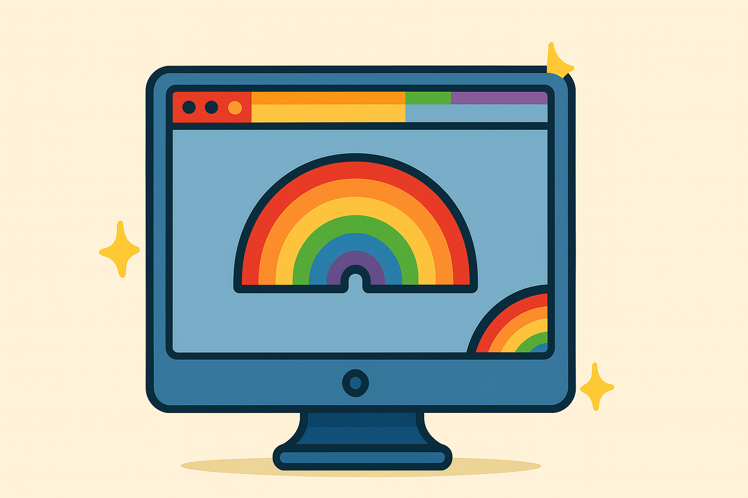
🌈
Sometimes the most meaningful updates to your app aren't new features - they're visual expressions of your values.
Whether it's Pride Month, showing support for diversity and inclusion, or simply wanting to add some colorful flair to your .NET MAUI app, rainbow gradients can make a powerful statement.
In this post, I'll show you how to add vibrant rainbow gradients to both your NavigationPage and Window.TitleBar and why this approach is cleaner than you might think.
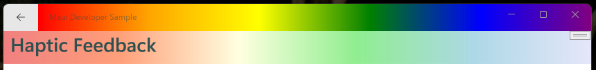
The Visual Impact
Before we dive into code, here's what we're building:
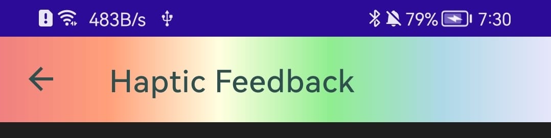
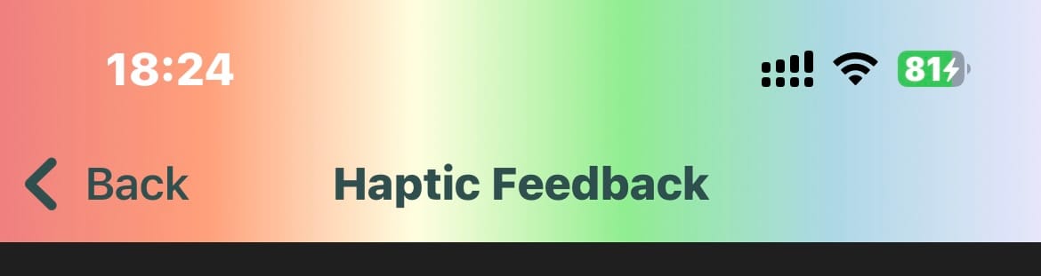
🎨 NavigationPage: A subtle pastel rainbow gradient for the navigation bar
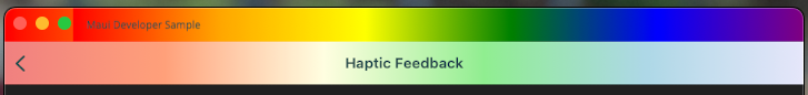
🖼️ Window TitleBar: A bold rainbow gradient for the desktop window title
⚖️ Balanced Design: Bright enough to show support, subtle enough for daily use
NavigationPage Rainbow Gradient
Let's start with the navigation bar. I'm using a pastel rainbow here - it's supportive but not overwhelming:
var rainbowPastelBrush = new LinearGradientBrush([
    new GradientStop(Colors.LightCoral, 0.0f),
    new GradientStop(Colors.LightSalmon, 0.2f),
    new GradientStop(Colors.LightYellow, 0.4f),
    new GradientStop(Colors.LightGreen, 0.6f),
    new GradientStop(Colors.LightBlue, 0.8f),
    new GradientStop(Colors.Lavender, 1.0f)
], new Point(0, 0), new Point(1, 0));

var navigationPage = new NavigationPage(mainPage)
{
    BarBackground = rainbowPastelBrush,
    BarTextColor = Colors.DarkSlateGray,
};
What this does
- Horizontal gradient:
Point(0,0)toPoint(1,0)creates left-to-right flow - Readable text:
DarkSlateGrayensures good contrast on light backgrounds
Window TitleBar Rainbow Gradient
For desktop apps, the window title bar is where we could show support :
var rainbowBrush = new LinearGradientBrush([
    new GradientStop(Colors.Red, 0.0f),
    new GradientStop(Colors.Orange, 0.2f),
    new GradientStop(Colors.Yellow, 0.4f),
    new GradientStop(Colors.Green, 0.6f),
    new GradientStop(Colors.Blue, 0.8f),
    new GradientStop(Colors.Purple, 1.0f)
], new Point(0, 0), new Point(1, 0));

var mainWindow = new Window(navigationPage)
{
    TitleBar = new TitleBar
    {
        Title = "Maui Developer Sample",
        ForegroundColor = Colors.DarkSlateGray,
        Background = rainbowBrush,
        HorizontalOptions = LayoutOptions.Fill,
        VerticalOptions = LayoutOptions.Fill,
        HeightRequest = 40,
    }
};
What this does
- Proper sizing:
HeightRequest = 40gives comfortable title bar height - Fill options: Ensures the gradient spans the entire title bar
- Dark text: Maintains readability across the color spectrum
Platform Considerations
🤖 Android: Navigation gradients work beautifully
🍏 iOS: Navigation gradients blend seamlessly with the top status bar
🖥️ Windows: The TitleBar gradient somehow doesn't apply under the back button ... I'll fix later.
🍎 macOS: TitleBar support varies by macOS version, there is a different gradient showing under the navigation buttons.
Why This Matters
Visual representation of support and values in your app:
- Inclusivity: Shows your app welcomes everyone
- Awareness: Demonstrates conscious support for important causes
- Community: Connects with users who share these values
- Professional: Shows thoughtful attention to social responsibility
Sometimes the smallest visual changes carry the biggest meaning. A rainbow gradient might seem simple, but to someone feeling unseen or unsupported, it can signal that your app - and by extension, you - see them.